Showing posts with label magazines. Show all posts

Monday, October 8, 2012

t h a n k y o u

Inside Out Magazine, 100th Anniversary issue, Nov./Dec. 2012


Oh boy -
For someone who doesn't feel that comfortable having their photo taken....
I believe I have just completed a quantum leap!!
Last week the latest edition of Inside Out Magazine was released onto the newsagency shelves, and look who made the final cut! eep!

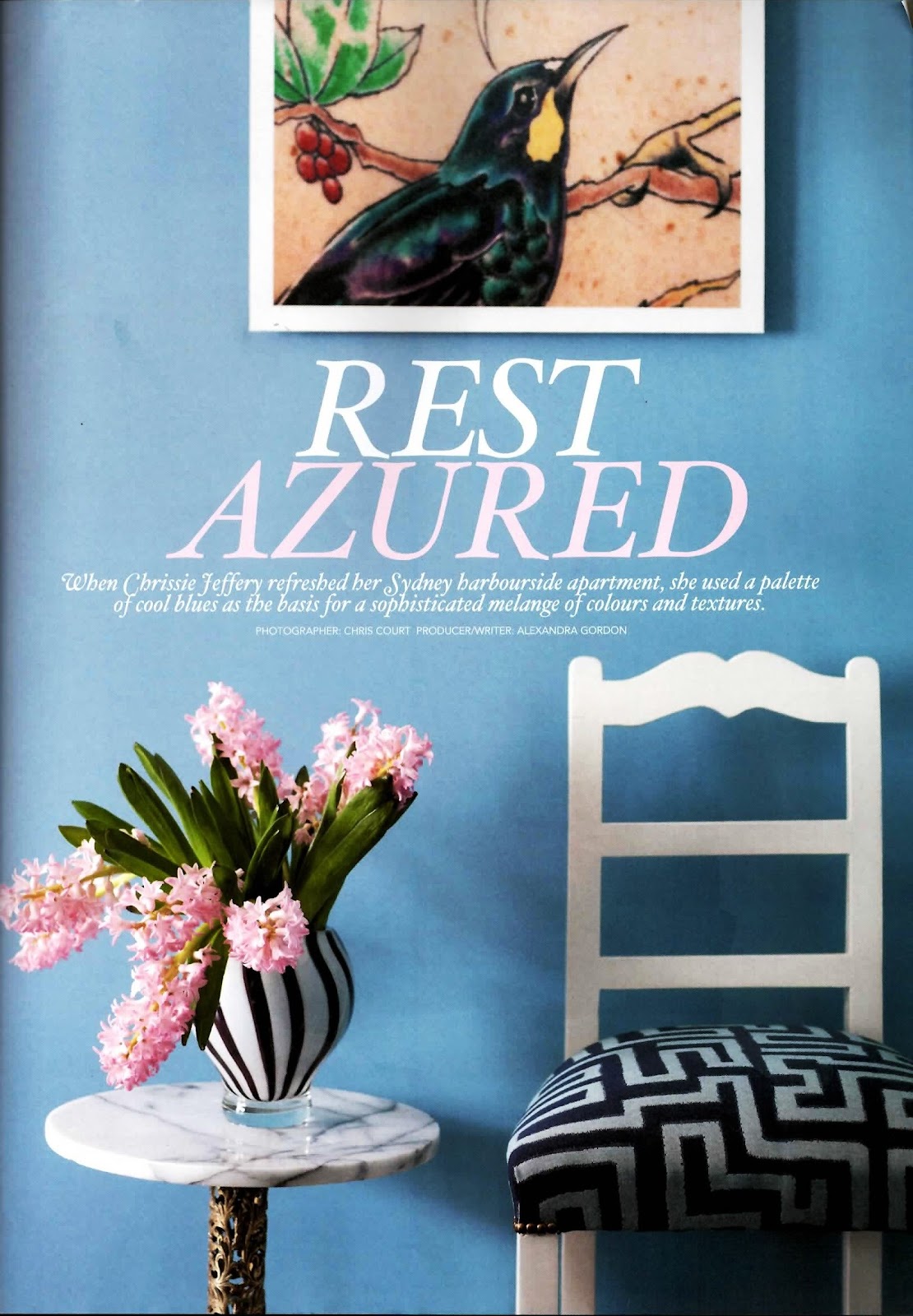
Inside Out is a magazine I have collected and coveted for many many years, so it was a huge shock and a huge honour to have been featured on their artist profile page, in their special 100th issue!! Especially when I had the privilege of being interviewed by Lee Tran Lam , and photographed by Craig Wall.

Thank you to Kate H. for all her help and support too.
I never really put myself, or my art 'out there' in any big way.
So to have this happen was a BIG surprise. 

Artist Profile page, Inside Out Magazine...
And...yep.... that's me!

And since people have started to see the article, all the questions that have come my way have been about my tiny jumpsuit! And I can't take any credit for that. The jumpsuit was made by my mum in the late 1960s - so I was very lucky to have inherited it from her and be able to fit into it! The earrings im weaving are by my amazing friend Mel Young, who coincidently has a huge exhibition opening at Craft on October 19! (formally called Craft Victoria)...

The exhibition is called Unnatural Tendencies and Lauren Simeoni will also be exhibiting her beautiful creations in this two person show that will be all about colour+ texture... in jewellery form!!

And finally - the ring that you can 'just' see in Craig's photo is by a lovely Sydney jeweller called Penny Snars. A ring that I wear ALOT! Thank you Penny...

But thank you again Inside Out!
Its a brilliant new edition and an amazing opportunity for my work...
.........
And on that note Ill sign off and see you in a week! 
Im taking a tiny break for a few days and so ill see you when I get back. 
Take care and have a lovely week....
{oh - and ps - if you would like to book in for any of the pop up workshops for October please email me and Ill get back to you...} cheers x

Tuesday, April 17, 2012

Wall styling.

Inside Out, Jul/Aug, 2007. Photography: Gaelle Le Boulicaut. Love the tones in this image.
From the warm modern floral wallpaper on the wall, to the taupe colour on the skirting, and
the bronze light that adds shine and visual interest... its all really simple and really clever.
 
It's raining its pouring 
The old man is snoring! 
I wish I was... 
Instead I was woken up early by a cat who wanted to avoid getting his paws wet. 
Anyway... today is indeed wet and the light is trying to get brighter and more daytime in feel... 

By now you may know Im working hard in the 'Cobweb + Laundry' studio.. aka the space underneath the house for a solo show in June... and on a wet and gloomy day its not the easiest place to create. 
{Which is a shame as I was getting on a good roll with the larger drawings... Boo hoo}.

So this morning I decided to turn to magazines for some light relief... and some inspiration as I love looking at the artwork people collect, and the creative ideas they have for their walls...
Yes. Crazy as a mad matter. I know. I know.

Today's inspiration comes courtesy of Inside Out circa 2007. And this time its not one article but a smorgasbord of images that featured throughout the issue. And in 2007 it was all about the re discovery of pattern, wallpaper, and textured treatments. 
My kind of interiors...

Still liking these cut out wallpaper projects that look great in a kids bedroom... This print is lovely and is
retro styled... as it comes complete with a cuckoo clock light. Its by Wonderland and the image
was styled by Claire Driscoll. Photography: Amanda Prior

What makes this wall amazing is not just the brilliant artwork hung in a salon style on the wall
but the added element of the chairs! They are amazing and are sculptures in their own right. Its like the
artwork on the wall has made its way to a 3d format on the floor. The image was styled by Shannon Fricke
and features in her book Sense of Style:Space. Photography: Prue Ruscoe

Love the colour and vintage feel of this image.
And all starts with the wallpaper print called
'Deer' by GP & Baker from Mokum. 

From red to bright yellow.
This beautiful image stands out not just for the fact there is a bright yellow chair sitting front and centre...
 It stands out because of the amazing textured and dishevelled wall treatment
 that tells a story...and adds character.
It also makes the pattern in the tiles work.
Styling : Claire Driscoll. Photography: Jason Loucas

And then there is the clever Glen Proebstel and his styling idea for pinning coloured swatches on the wall...
So simple. So clever. Framed or unframed this would add colour and texture in one hour to any wall space!

Quicker than eight months in the studio creating a series of artworks.. that's for sure.
Photgraphy: Amanda Prior.

Thursday, March 22, 2012

crafty collecting master class.

The home of Penelope Durston from the Melbourne store Cottage Industry,
captured on the pages of Inside Out Magazine, Nov./Dec. 2010


This article from Inside Out Magazine is an oldie but a goodie. 
For many of you in Melbourne, or in the know about anything and everything crafty, today's article will be familiar to you.... I mean... how could you be out of the loop when talking about the amazing Penelope Durston. Her store {Cottage Industry} and blog {Miss Pen Pen} are legendary, as is her crafty and creative style for all things colourful, textural and vintage. 
She isnt called the Craft Queen for nothing! 

When this article was published on the pages of Inside Out magazine in 2010 I fell in love. It was my dream space. Lucy from The Design Files, who wrote and styled this story, did an amazing job at capturing her flair and enthusiasm for collecting and assorting her many objects into beautifully curated displays that 'tell a story'. And that is truly the key for all of us out there who love collecting objects that others may call HOARDING! Its not I tells ya! Its collecting and appreciating things that have a touch of the hand made about them... objects that have a history, a soul and an expression of a time and place. 
I call it 'textural time travel'. 
And if youre thinking ?????, just look at the way Penelope does it.


Penelope sitting on her staircase next to a beautifully embroidered owl... you know I love that!
The key to Pen's collecting is to constantly sort and display in an array of
lovely vessels, jars, wooden boxes etc. 

This is my favourite photo. Love the salon style hang of 1960s sample embroideries
on the wall... all colourful and complementary to each other. The wooden furniture adds warmth and
character and a sense of history...

Pattern on pattern. Nothing wrong about that! 

Pressed Metal splash backs are so great for a kitchen. Left unpainted they add texture and shine
and interest without being fussy or delicate. Its industrial but crafty at the same time...


Credits: The Crafty Home, Inside Out Magazine, Nov/Dec 2010, pg. 79
Words + Styling: Lucy Feagins
Photography: John Laurie

Wednesday, February 29, 2012

the quiet seduction...

New York home of Maya Marzolf, Inside Out Magazine, Sept/Oct 2010

Have you ever noticed that sometimes it can be the quiet + unassuming things that can be so so seductive? This phenomena happened to me yesterday as I was unpacking a box of ceramic pieces at Object Gallery. The package in question was from the lovely Honor Freeman and the ceramics were beautiful production pourers and beakers that were destined for the store. 

I don't think its any surprise to you all that I love ceramics and the work of Honor. Her work is quiet, delicate, fragile and so skilfully crafted that its hard not to love it! But that can sometimes be its Achilles heel. Her pieces do not scream or shout at you to look at them. They sit and wait for a patient eye to look at their details, and a slow hand to pick them up and feel their marks and glazes. There are no strong colours or graffiti statements to grab you and demand your attention.

Its the complete opposite. 

The same could be said of this Brownstone home in New York. The look by Maya Marzolf may be 'World Traveller' but the way that it has been collected is anything but colourful, textural and wild. 

Maya who was a photographic producer for Vogue, but now owns an antiques store called Le Grenier, is a French/Finnish 34 year old who moved to this atmospheric Greenpoint apartment in Brooklyn seven years ago in order to renovate and create a unique space to reflect her love of eclectic, exotic and industrial things that 'hold a tale'. 

Maya in her quiet space... 

Rough, white, textured walls... love it. They add character and warmth to a quiet space.
And that bookcase is amazing. It was made by recycling old timber beams
to look as if it was always meant to be there...

I guess this is what you would call an antique, industrial, world traveller look! I love all the wood
that warms up the space and the vintage icebox that was been converted into a liquor cabinet.
The Dutch chandelier adds a feminine lightness to the the look and her Burmese cat Le Golgot loves the
light pouring in through the window!

Lots of small textural details from her many objects on display. From a pure white
ceramic collection on the mantel, to a rustic birdcage found in upstate New York....
I love the antique bed too with a lovely round mirror above it. The tiny objects displayed
above the light switch adds a beautiful touch too.
My favourite shot. Has to be one of the best ideas for a bathroom wall - a hand drawn mural
 of nautical objects which Maya has called 'Things that get washed up on the shore'.
It was completed by artist Weston Woolley and he has used a style similar to what you
would find in old botanical books. 


All these details may be subtle and quiet - but isn't that what you sometimes crave in a home space? 

The chance to breathe, be still and just let the eye wander over the small and delicate details that normally go unnoticed...


Credits: 
Article :The Cosmopolitan 
Inside Out Magazine
Sept/Oct 2010, pg 109
Words: Hilary Robertson, Photographer : Matthew Williams

Wednesday, January 11, 2012

The Evolving Home


Does anyone recall what they did BC... Before Christmas? 
I don't.
That time has already become a slurry of partial memories, catch ups and to do lists that resulted in me getting through that time relatively..... intact! It's amazing how a month can suddenly become a 'distant memory' when it was, in actual fact, a couple of weeks ago. Maybe its because I'm now in holiday mode and the summer weather has well and truly arrived?! 
Maybe its because Ive kicked into another gear, a calmer gear, that has a restorative feel?! Maybe its a little from column a and a little of column b!!

All I know is that I have suddenly rediscovered all my holiday activities which include: catching up with friends that I see all too rarely, taking trips to parts of the city I rarely explore... and sittings down to devour a pile of magazines that never got the chance to be look at many months ago...

One such magazine was the Nov/Dec 2011 issue of Vogue Living. I know I had a brief flick weeks ago, but only now am I discovering the feature articles on people such Nicki Townsend... with images that are truly inspiring {for all the colour-philes out there!}  


Nicki Townsend, an Australian Art specialist working at Michael Reid Gallery, lives with her husband Andy Martyr and two children in this colourfully layered home in Sydney, a home that is dotted with so many patterns that it makes me want to sit and study these glossy photos for hours. 

Each room is unique and has its own sense of style that you can only call ... eclectic! There are contemporary paintings by artists such as Ben Quilty, animal sculptures by Tjampi Desert Weavers, and an amazing Tibetan wooden cabinet {that you can see in the image above}....

Nicki has no fear of colourful furniture... Instead she has added to it by layering
colourful textile cushions into the mix from places such as India...

Love that Nicki has painted the inside of the kitchen cabinets a strong green to compliment and contrast with the 'flo' kitchen stools by Patricia Urquiola for Driade ....

Love the yellow textile on the light shade! In this room there is a sense of natural warmth
with the nude and brown colours on the sofa, wicker chair and curtains... and yet there are some beautiful
textiles in the cushions and lamp shade that make the whole effect work.

The family dog... Otis flanked by an amazing sculpture by Linde Ivimey and painting by Patrick
Thungurrayi...

Textured details from the master bedroom....

This is my favourite space... and photo!
Its from daughter Phoebe's bedroom... I love THAT hat collection and how it has been displayed on the mirror.
Coupled with the chair and Afghan basket, this room is so so complex... in the way it has been brought together, and in the huge shifts of colour ways.

And then we come to the cool cool tones of the master bedroom and en suite.
The wall paper in the bathroom is by Florence Broadhurst - giving a nod to the past and adding a very nostalgic effect to the space.

And then we come to the view and the room with a view.
Beautiful and serene... and a perfect way to see how all the colour inside
references all the colour outside... on the beautiful harbour.


'It's all still evolving for me. 
I don't know - how do you know when you finish a house?' - Nicki Townsend
Good question to finish on methinks!


Credits: Vogue Living, Nov/ Dec 2011, pg 174 - 183. 
Written/Produced : Alexandra Gordon, Photographer : Chris Court

Wednesday, November 9, 2011

the personal touch


It's beginning to look a lot like Christmas.
Like Starbucks in the noughties, Christmas decorations seem to be springing up in the blink of an eye! What is it about glitter and fairy lights that makes people get excited? 
Dont get me wrong... Im no Scrooge. 
I do love the sentiment of 'good will to all men', and I love spending time with my lovely family and friends. It's just the over kill of tacky plastic trees and green and red baubles in every 7-11 and service station that gets me! Would you miss all those decorations if they weren't in front of your eyes at every turn? 
I think that is why I like these two images. They are about Christmas, but done in a very personal and quiet way... They are courtesy of Lynsey Fryers, an English stylist who lived in Sydney and worked for magazines like Inside Out a few years ago before moving back overseas... 
And you gotta love that beautiful leather seat in the image below! Love it...
x

Photos courtesy of Inside Out Christmas Edition 2008, taken by Petrina Tinslay.

Wednesday, October 26, 2011

unique inspiration

Jenny Kee, Sunday Life Magazine October 2011

'It's amazing to come full circle; here I am bringing back the 30s scarf we wore in the 60s
with my designs from the 1980s into 2011'.... Jenny Kee

Oh Jenny Kee you are amazing. 
Last Sunday I nearly choked on my cup of tea when I saw the front cover of The Sun Herald's Sunday Life Magazine completely covered with colour, pattern and life... all emanating from the radiant Jenny Kee. For those who don't know, or remember Jenny Kee, she was the face of the 1980s in Australia. She arrived back onto the local scene in 1972 after living for more than a decade in good ol' London Town, and shocked the boring and staid Sydney fashion world by opening a store called Flamingo Park in The Strand Arcade. 
I just thought, 'Whatever I do with this shop it's got to be absolutely unique'. And that is what London gave me - being original'. 
Like Florence Broadhurst's wallpaper designs of the 1970s, Jenny revolutionised the 80s textile world by creating a new + fresh aesthetic that spoke to Australian colour palette, visualising native flowers and plants in patterns that were bold, big and full of 80s excess...

And look at her today. Jenny is still the same amazingly unique woman that burst onto the scene in the 80s. Colourful, creative, and patterned to an inch of her life, she is still making it all work, without a shoulder pad in sight. She is a true inspiration for me, and as such I went all fluro yesterday.... well.... on my hands anyway. 


Happy Hands, October 2011


Credits: The Trip that changed me, Article from The Sun Herald's Sunday Life Magazine, October 23 2011, pg. 12-13, Images from 'A Big Life'  by Jenny Kee (Lantern)

Wednesday, September 14, 2011

naughty corner


oooo... Ive put myself in the naughty corner!
And why?
Because I did not do my accreditation's 
for my last posting!! Naughty naughty tiny...
So instead of editing the post I thought Id quickly 
add them in now...
Forgive me all you blog accreditation lovers out there!
I am normally very good...

Rest Azured Article
Vogue Living Aug/Sept 2011
Photographer: Chris Court (my old next door neighbour!)
Producer/Writer: Alexandra Gordon
Thank you...
 and good night!

Pattern lovin'...


Does anyone ever remember going over to a friends house after school as a kid and thinking...'Man, I would love to have a place exactly like this when I grow up!?' I do. I remember flopping onto the comfy coloured couch with an afternoon snack in my hand, and instead of watching the cartoons, looking with wonder at the artworks on the wall and the objects on the bookshelf and wondering where all these amazing things came from and how they put it all together...

Well the beautiful Harbour side apartment of Chrissie Jeffrey featured in the AUG/Sept issue of Australian Vogue Living brought all those childhood memories flooding back to me. And I just had to share...

Chrissie has created a comfortable, light and colourful home in Sydney that I STILL wish I could procure for myself!!! Oh dear - when will I grow up and have a big persons place all of my very own? I wonder...
But for now I can admire and scrapbook this article for future reference.
Hope you enjoy it too....


I LOVE this!!! The red and blue in the hallway is so bold. But what is even better is that the walls are covered in blue textured wallpaper! It has a light stripe through it, making it soft and giving movement. It actually reminds me of an Aboriginal painting from Papunya.


Chrissie has hung her artworks in a salon style, but she has still kept the walls light and complimentary with everything else in the room by using a neutral wall paint... that looks earthy + bronze.


Great pink fabric couch, layered with as many colourfully patterned cushions as possible! The light filtering through the big window lightens the strong colour palette too...


More patterns!!! More red + blue mixed together. This time in the bedroom with touches of white, to again lighten a space that could be too busy for a bedroom. The stripes looks so great against the red headboard too...


And if you thought that was a lot.... take a look at the dining area with an amazing light fixture and more colour on the walls through paint colour and artwork....
Its just too good! 

Monday, August 8, 2011

pure + general


Hello everyone and hello to another Monday and the second week of August. AUGUST! Crazy pants... I cannot believe we are on the home stretch with regards to Winter. And if last weeks happy sunny weather is anything to go by its going to be a beautiful start to Spring... the happiest time of the year! Well to me it is. Boy, do I sound very Disney today or what?!

With a new month comes new magazines and this new edition by Inside Out is a good one. There is a lot of colour, alot of texture, and a brilliant feature on the home of Pure + General's Linda Gregoriou.... Perfect timing too as I had recently visited this amazingly beautiful store and walked out wondering what Linda's home looked like! Now I'm very Disney AND a big sticky beak!!

Anyway Pure + General located on Brougham Street Potts Point {which is right near the Coca Cola sign in Kings Cross} is the brainchild of Linda who decided it was high time Sydney had a store that felt, and looked like the inside of a world traveller's suitcase... and it does indeed! This white industrial store, created by architect Dale Jones-Evans, is the simple frame for Linda to hang the assortment of furniture, soft furnishings, and eclectic objects she has sourced from  countries such as Japan, Morocco, India, France, and Australia's indigenous red centre...


This living room says it all really, a true reflection of Linda's aesthetic for the store. The green walls and the red textile rug work so so well, giving the space the perfect grounding  for all the objects to pop and shine...


This is Linda here on her staircase, above, looking as colourful as her space.
She definitely wears her style on her sleeve....


The old French wall cabinet in this shot was one of my favourite pieces from Pure + General. The chipped cream paint and little wooden draws are so lovely and so simple, creating a textural and functional impression on the wall that is somewhere in-between an artwork and a piece of furniture. 
Below is Linda's amazing collection of woven bags which you can find in the store too. Many are from indigenous art communities in Australia which Linda loves to promote as they are functional and autobiographical: 
Artisan, hand-made pieces have a story, and the essence of the person in them, which makes them more fascinating. 
Like any artwork, you are investing in the artist and their art practice, and that is always a good thing...


Thank you Inside Out, and Linda, for giving us a sneak peak into a world that is definitely inspirational for me! If I cant travel to all these places, at least I can take a small sample of their creative aesthetic home with me!! World traveller mash up is my type of style inspiration... always and forever!


Inside Out Sept/Oct 2011. 
Styling: Tami Christiansen 
Photography: Tony Amos 
Words: Stephanie Epiro 
Pure+ General 
114 Brougham St 
Potts Point